The 'Extended Attention Ratio' for Landing page optimisation
A simple principle to improve conversion
The ‘Extended Attention Ratio’, what is it?
It’s something that I’ve made up.
But it’s useful and you can use it to audit and objectively measure your landing pages or even your competitor’s landing pages. In Phil waffle “it’s a scalable rating system that helped articulate and summarise some of the best practice principles I recommend you use when paying for traffic to your landing pages”, keep reading and it’ll be a bit clearer and I’ll give you some examples.
Landing page optimisation is a science and an art form. It can be very complex to fine tune and requires lots of iterations and tests to find the optimum solution, so a method of rating is not going to give you a complete picture. However the ‘Extended Attention Ratio’ can help you objectively measure and refine your landing pages.
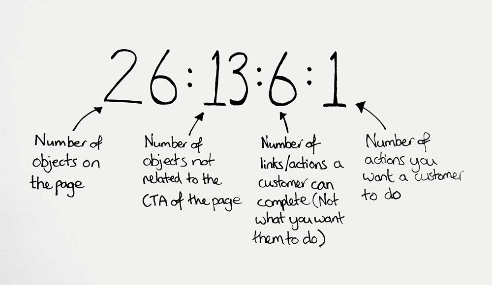
So here it is and example…
Let’s break this down.
-
The first step is to establish the total number of objects on the page, this includes blocks of text (round this up to 1 object if presented together), images, lists, headings, links (separate objects) etc.
-
The next step is to establish how many of these objects are supportive of the main CTA / objective of the page. For example, if the main objective of the page is to open a Current savings account, and the object is a list of benefits for the account, this is supportive of the CTA. However, if the object is introducing another type of savings account, let’s say a credit card, it is not supportive of the main CTA, in this case it should not be counted.
- Next up is the Number of links / actions a customer can complete but are not what you want them to do. For example, keeping our theme of a Current savings account sign up page, this could be links to other products or to corporate pages such as Careers pages, basically any other page then the next step in the sign up funnel. This should also include associated pages such as Terms & Conditions of the account or a separate page detailing the benefits of the account. Why? Because this is not the main objective, the customer has gone down a separate path and might not come back. If they have questions they should be answered on the landing page.
- Finally, we have the number of actions you want them to do, this should ideally be 1, however in some scenarios you may need another CTA. For example, you may have a sign up CTA but also a callback CTA, in this case the CTAs are complementary.
With this in mind, let’s look at a real example.
Example case study - Tesco Fixed rate ISA
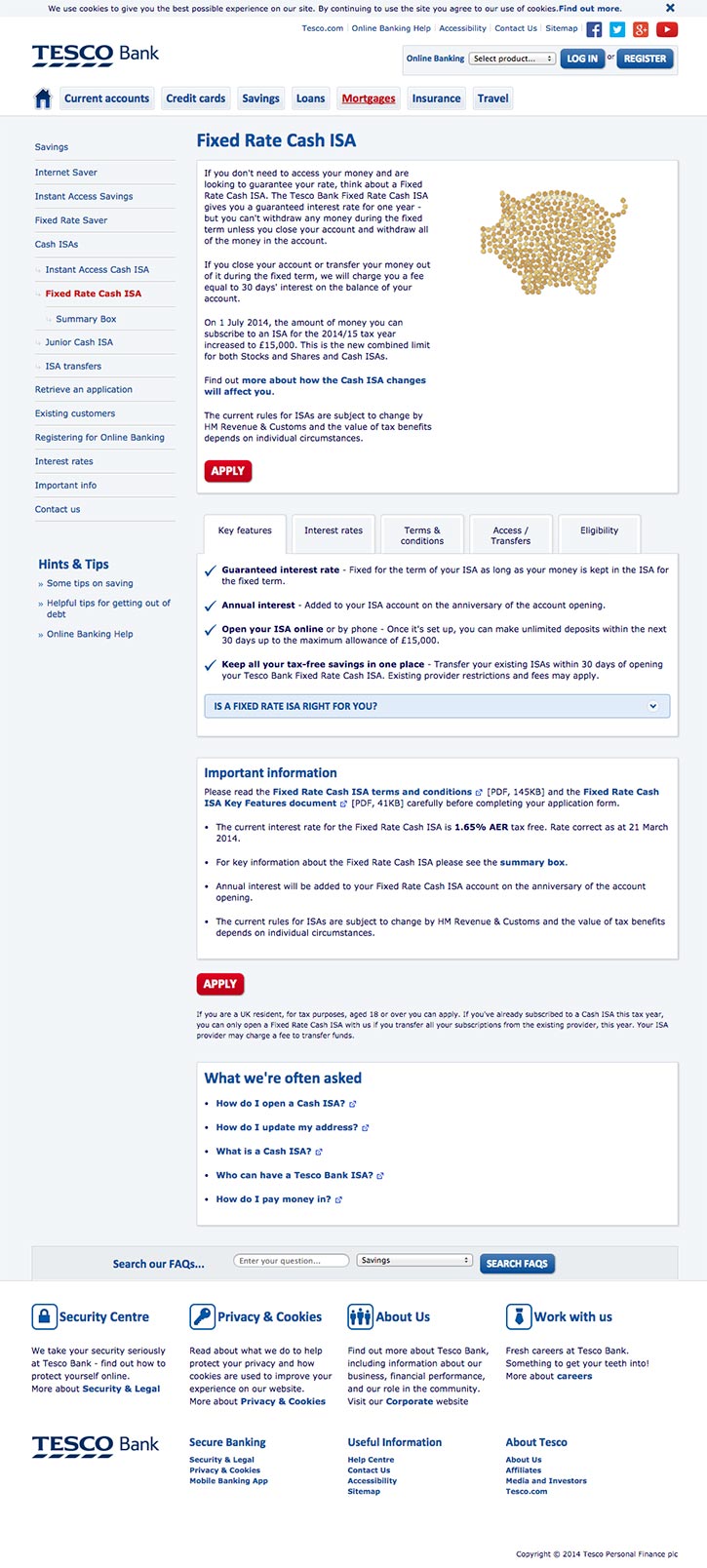
Here is the page that Tesco is sending it’s PPC traffic to.

This has an extended attention score of 82:10:72:2
This is not a great score. Now lets be honest, the main reason behind this poor score is because they’re sending paid traffic to a normal page within the main website and not a targeted landing page. Creating specific targeted PPC landing pages is a must for any organisation.
The cost of keywords such as ‘fixed rate cash isa’ is about £1.50 per click (correct at the time of writing). This is quite a lot of spend to be pushing to a page that introduces other types of accounts when the customer is most likely just looking for a ‘fixed rate cash isa’. Landing pages should be refined and ‘on message’, once you start mixing the message and introducing other types of accounts, it starts to create doubt, they may get distracted and want to compare which one is best for them, ultimately getting distracted from their original mission.
Landing pages should be refined and ‘on message’, once you start mixing the message and introducing other types of accounts, it starts to create doubt
If the search keywords were ‘compare isa’ etc then it would be good to show your range of accounts, but this type of traffic is less likely to commit there and then so maybe less of a priority.
Explaining the Extended Attention Ratio
Going back to our score of 82:10:71:2, let’s break this down.
The first two numbers tell us that there are 82 objects on the page but only 10 of them relate to our page objective (applying for a fixed rate ISA), meaning that the page is is not focused on our mission. You want these numbers to be as close as possible to each other. It’s not a concern if both numbers are high i.e. 82:79, whilst reducing the total number of objects on the page is a common tactic to improve performance, some times there’s a need to create longer pages with lots of content to convince the customer they are making the right purchase. As long as the content focused on the mission that is.
The last two numbers tell us that there are 71 links / actions that the customer can do that are NOT related to our mission vs two links that are. This is a worrying difference. Simply reducing the number of links to non-related content will help focus this page on our goal.
Remove anything you don’t need to display
Granted, there are some links and information that just have to be presented. However anything that you don’t have to display, get rid of it.
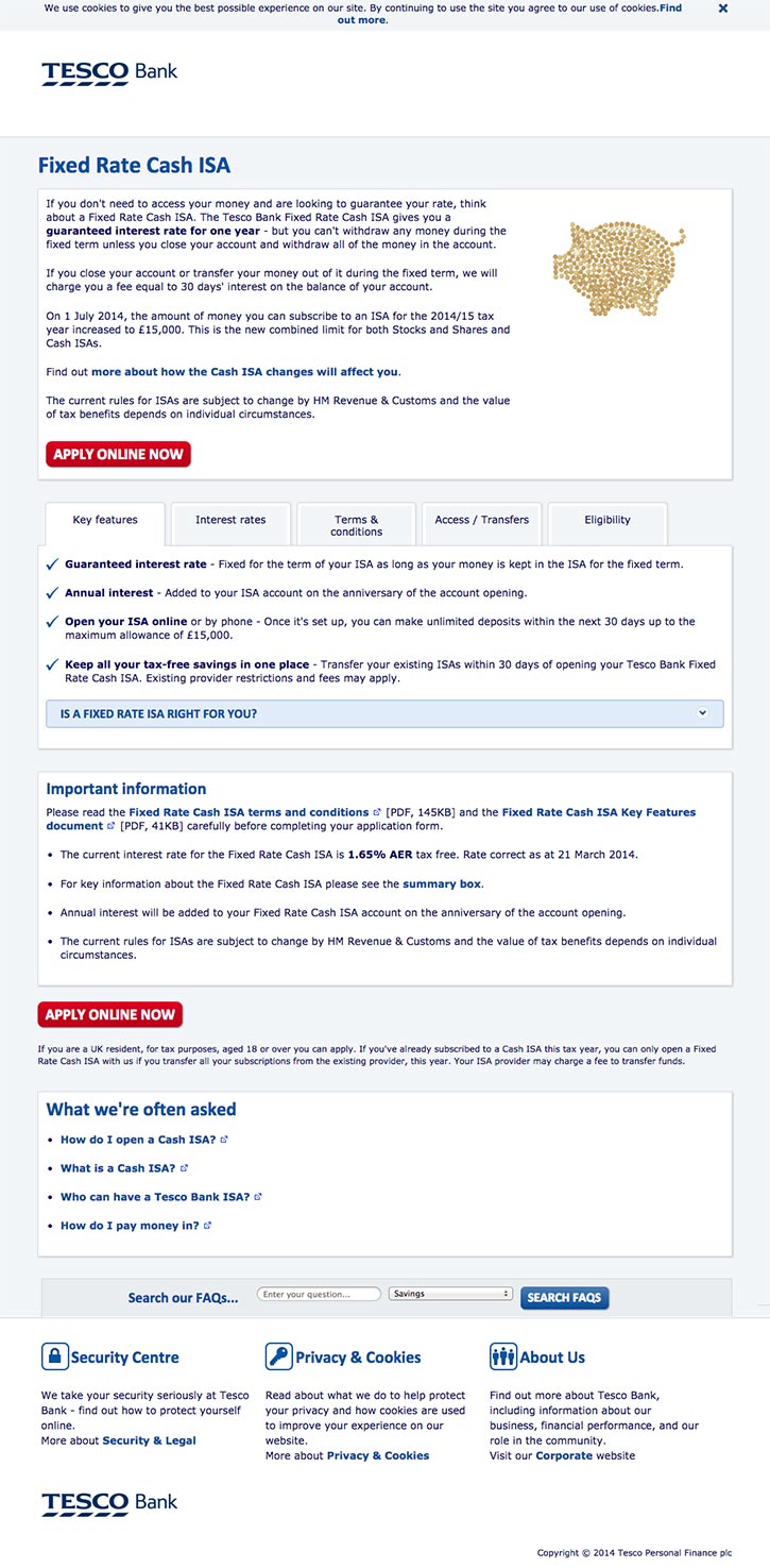
To illustrate how to make Tesco’s Fixed Rate ISA landing page optimised and focused on the page objective I’ve removed unnecessary links and information using simple browser tools…

This has an attention ratio score of 27:21:14:2
Not perfect but much better, all we’ve done is remove elements.
You can see that the first two numbers are a lot closer, a difference of 6 compared to a difference of 72.
The last two numbers are also improved, a difference of 12 compared to the previous difference of 69!
