Nice UX: Google Inbox
A very sad story about how Google Inbox destroyed my goal and why I forgive it.
I’ve been a Gmail user since 2004 and I’ve loved the one inbox approach, relying on Google’s sophisticated search algorithm to find / organise my email rather than my own folder vs labelling system.
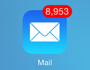
Some people aim for a zero inbox approach, I do this for work but for my personal email I never bothered and I inadvertently found that I had a very sad personal goal to reach 10,000 unopened email…

…mainly based upon Sales and E-newsletters from Supermarkets etc that I’d signed up to for competitor research at some point.
I got so so close to my very sad goal, reaching 9,946 unopened email but about four months ago I did something terrible, I signed up for Googles Inbox. Inbox looked at my email, asked me a few questions which I completely agreed with and took it upon itself to clean up my mess! In one foul swoop I was down to circa 4,000 unopened email and the more I use Inbox the further it’s going down.
I’ve given up my goal but it was worth it. Google has changed my approach to email, I spend less time on my email as Google prioritises it for me, and I have a new goal to get to zero unopened emails.
Anyway, here’s some nice UX features from Inbox.
All of these are examples of how inbox pulls out contextual information from your email into the summary space.
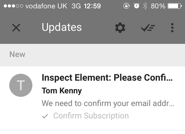
No need to open an email subscription email, tap or click directly from your inbox…

…get feedback after you’ve subscribed…

Contextual info on purchases…


Content from group conversations…

Video…

Download links…

Contextual set reminder…
